rcParamsの使い方
論文用のグラフを作るためには、matplotlibを使いこなす必要がある。
全オプションは plt.rcParams.keys() で確認できる。
rdParamsはこのページを参考にした
matplotlibでTimes New Romanが意図せずボールド体になってしまうときの対処法 - Qiita
import numpy as np
import matplotlib.pyplot as plt
import matplotlib
plt.rcParams["font.family"] = "Times New Roman"
plt.rcParams["font.size"] = 14
plt.rcParams["xtick.direction"] = "in"
plt.rcParams["ytick.direction"] = "in"
plt.rcParams["xtick.minor.visible"] = True
plt.rcParams["ytick.minor.visible"] = True
plt.rcParams["xtick.major.width"] = 1.0
plt.rcParams["ytick.major.width"] = 1.0
plt.rcParams["xtick.minor.width"] = 1.0
plt.rcParams["ytick.minor.width"] = 1.0
plt.rcParams["xtick.major.size"] = 10
plt.rcParams["ytick.major.size"] = 10
plt.rcParams["xtick.minor.size"] = 5
plt.rcParams["ytick.minor.size"] = 5
plt.rcParams['xtick.top'] = False
plt.rcParams['ytick.right'] = False
plt.rcParams["axes.linewidth"] = 1.0
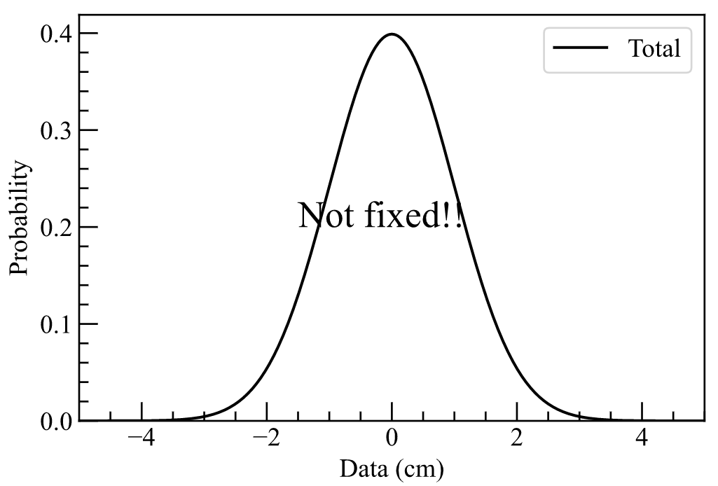
def gaussian_func(arr, constant, mean, sigma):
return constant * np.exp(- (arr - mean) ** 2 / (2 * sigma ** 2))/(2*np.pi*sigma**2)**0.5
x = np.linspace(-5, 5, 1000)
y =gaussian_func(x, 1.0, 0, 1)
fig = plt.figure()
ax = fig.add_subplot(111)
ax.plot(x,y,"k-",label="Total")
ax.set_xlim(-5, 5)
ax.set_ylim(0,None)
plt.legend()
plt.ylabel("Probability")
plt.xlabel("Data (cm)")
plt.text(-1.5, 0.2, r'Not fixed!!', size = 20, color = "black")
plt.savefig(f"gaussian.svg")
plt.savefig(f"gaussian.png")
plt.show()
単位はインチ
plt.rcParams['figure.figsize'] = [15, 10]
アスペクト比を設定
アスペクト比を調整 matplotlib.axes.Axes.set_aspect
import matplotlib.pyplot as plt
plt.subplot(1, 2, 1)
plt.plot([0,10],[0,40])
plt.gca().set_aspect('equal')

plt.subplot(1, 2, 2)
plt.plot([0,10],[0,40])
plt.gca().set_aspect(0.25)
plt.show()
上下左右の隙間を設定する
hspaceとwspaceはsubplots間の縦と横の隙間。
plt.rcParams["figure.subplot.top"]=0.88
plt.rcParams["figure.subplot.bottom"]=0.11
plt.rcParams["figure.subplot.right"]=0.9
plt.rcParams["figure.subplot.left"]=0.125
plt.rcParams["figure.subplot.hspace"]=0.2
plt.rcParams["figure.subplot.wspace"]=0.2
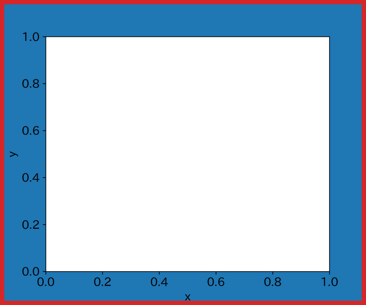
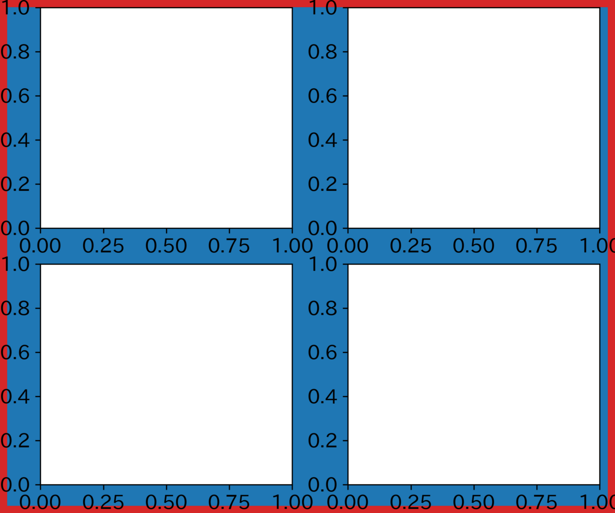
fig, ax = plt.subplots(2, 2,figsize=(6,5), facecolor='tab:blue', linewidth=10, edgecolor='tab:red')
plt.savefig("temp.png",dpi=300)
plt.show()
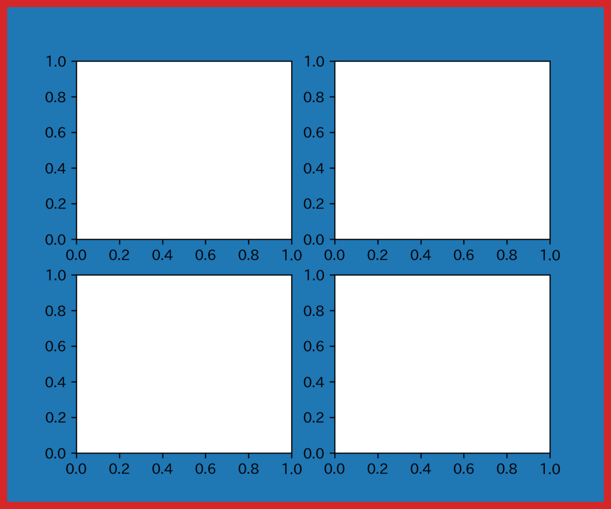
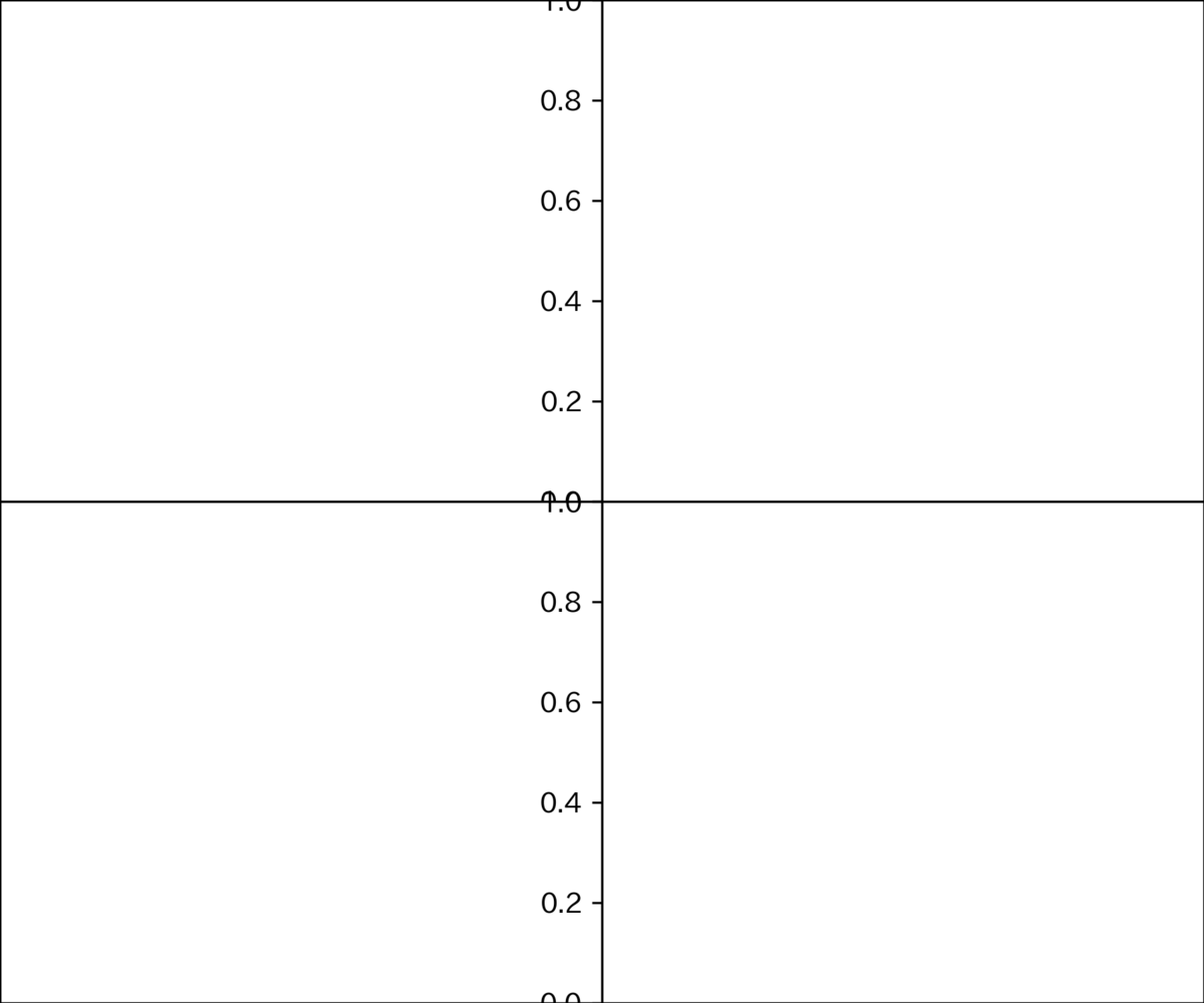
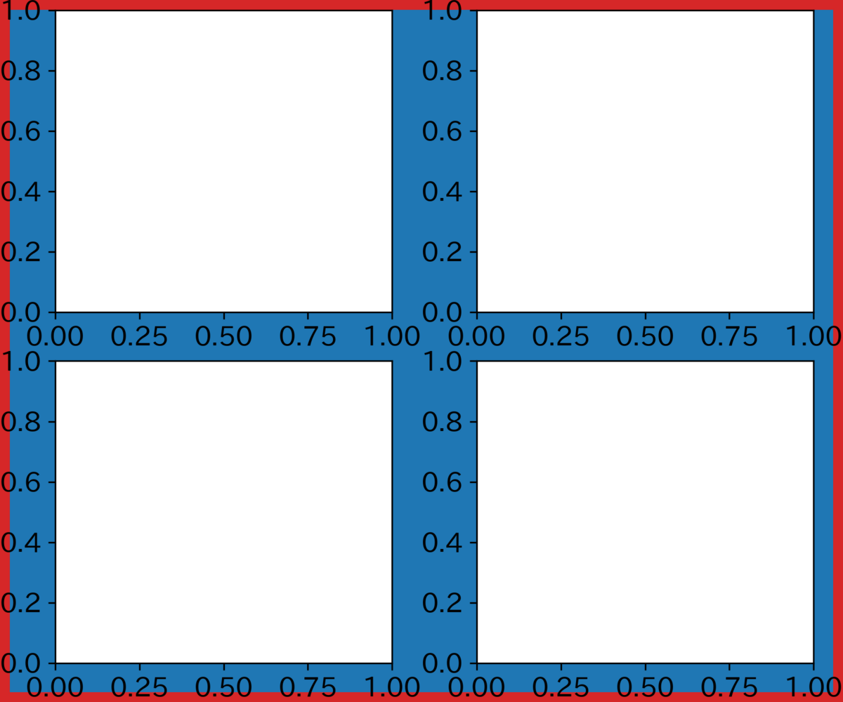
fig.subplots_adjust でも設定できる 上下左右の相対位置を端にして、subplots間の隙間も0にしてみた。
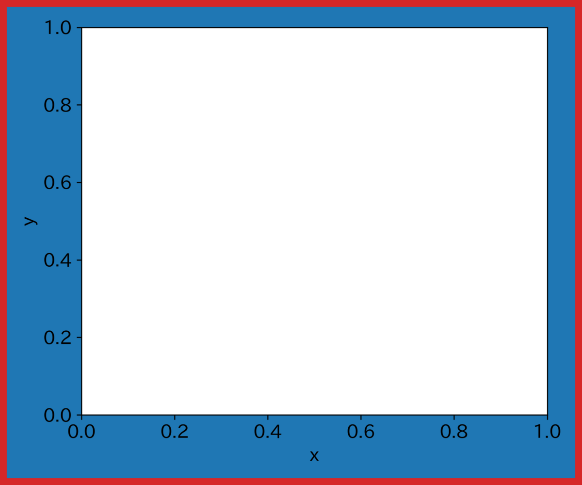
fig, ax = plt.subplots(2, 2,figsize=(6,5), facecolor='tab:blue', linewidth=10, edgecolor='tab:red')
fig.subplots_adjust(top=1,bottom=0,right=1,left=0,hspace=0,wspace=0)
plt.savefig("temp.png",dpi=300)
plt.show()
figsizeに合わせて上下左右とsubplots間の隙間を自動調整
通常、設定した上下左右の枠の位置に沿ってグラフは出力されるので、切れてしまうことがある。描画に応じて出力したい場合は以下のコマンドを使う。
plt.tight_layout()
plt.savefig("result.png", bbox_inches="tight")
ちなみに、jupyter labなどを使うと自動的にtight_layoutしたグラフが表示される。
さらに細かくレイアウトを調整
レイアウトの指定なしの場合
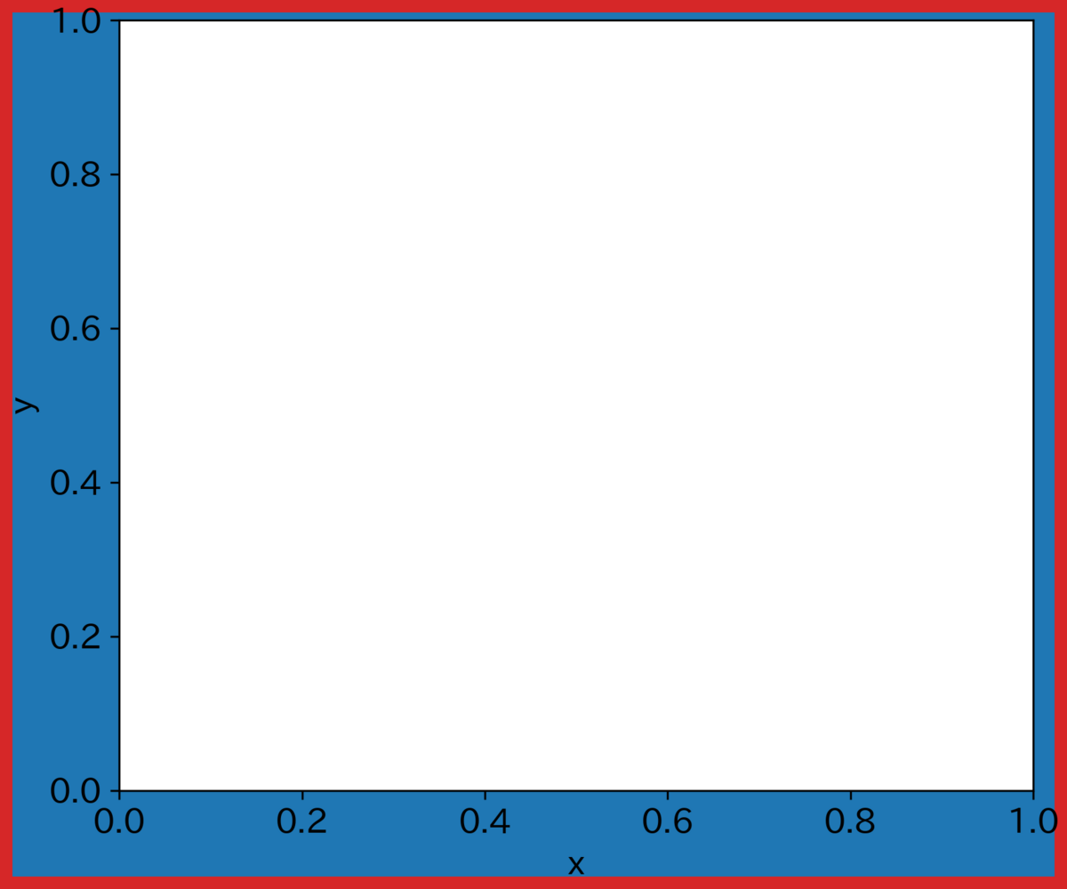
fig,ax = plt.subplots(figsize=(6,5), facecolor='tab:blue', linewidth=10, edgecolor='tab:red')
ax.set_xlabel("x")
ax.set_ylabel("y")
plt.savefig("temp.png",dpi=300)
plt.show()
設定どおりの上下左右の隙間が使われるので無駄なスペースが気になる。
上下左右の隙間を数字やラベルに応じて自動調整してほしい場合は、一般的には tight_layout を使う。plt.subplots で指定するか、ファイル出力前にplt.tight_layout()とする。
fig,ax = plt.subplots(figsize=(6,5), tight_layout=True, facecolor='tab:blue', linewidth=10, edgecolor='tab:red')
ax.set_xlabel("x")
ax.set_ylabel("y")
plt.savefig("temp.png",dpi=300)
plt.show()
無駄なスペースが減った。
pad 周囲の隙間、h_padとw_padはそれぞれsubplots間の縦と横の隙間である。ただし、目盛りラベルが全て描画されるように調整されるので、h_pad=0やw_pad=0で必ずしもsubplots間の隙間がなくなるとは限らない。目盛りラベルに関係なく隙間を完全になくしたい場合はfig.subplots_adjust(hspace=0,wspace=0)を使うべきである。
fig,ax = plt.subplots(2, 2, figsize=(6,5), tight_layout={"pad":0,"h_pad":0,"w_pad":0}, facecolor='tab:blue', linewidth=10, edgecolor='tab:red')
plt.subplots_adjust(wspace=0, hspace=0, top=1, bottom=0, right=1, left=0)
plt.savefig("temp.png",dpi=300)
plt.show()
最近、constrained_layout というモードが追加された。
matplotlib.org
ユーザーが要求した論理レイアウトを可能な限り維持しながら、Figure ウィンドウに収まるようにサブプロットや凡例やカラーバーなどの装飾を自動的に調整します
らしい。
fig,ax = plt.subplots(figsize=(6,5), constrained_layout=True, facecolor='tab:blue', linewidth=10, edgecolor='tab:red')
ax.set_xlabel("x")
ax.set_ylabel("y")
plt.savefig("temp.png",dpi=300)
plt.show()
端のスペースがほぼなくなった。
隙間は、h_padで縦方向の隙間を、w_padで横方向の隙間を、hspaceとwspaceで それぞれsubplots間の縦と横の隙間を指定できる。
fig,ax = plt.subplots(2, 2, figsize=(6,5), constrained_layout={"hspace":0,"wspace":0,"h_pad":0,"w_pad":0}, facecolor='tab:blue', linewidth=10, edgecolor='tab:red')
plt.savefig("temp.png",dpi=300)
plt.show()
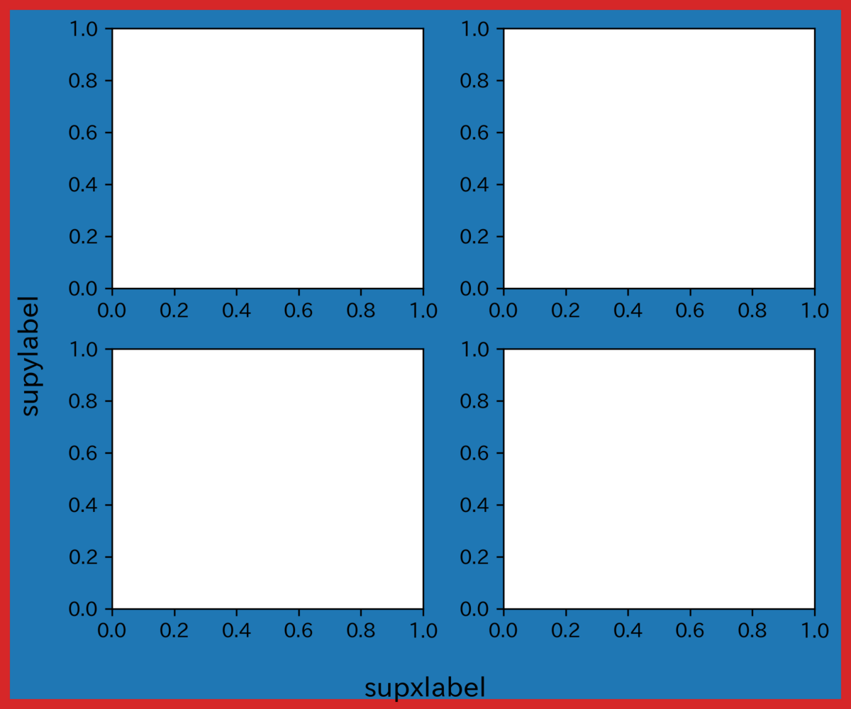
subplotsに共通の軸ラベルを付ける
figに対してfig.supxlabel()やfig.supylabel()を行う。
import matplotlib.pyplot as plt
fig,ax = plt.subplots(2, 2, figsize=(6,5), facecolor='tab:blue', linewidth=10, edgecolor='tab:red')
fig.supxlabel('supxlabel',fontsize=14)
fig.supylabel('supylabel',fontsize=14)
plt.tight_layout()
plt.savefig("temp.png",dpi=300)
plt.show()
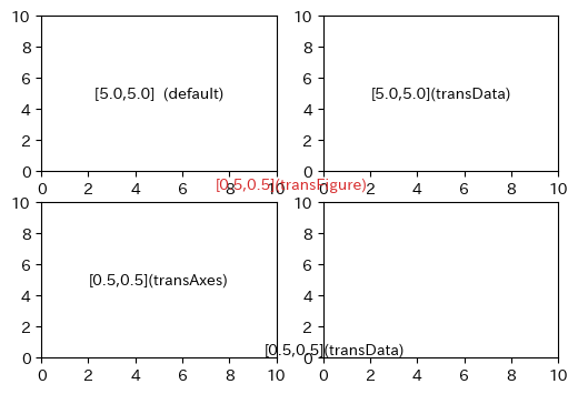
初期設定では、テキストを設定するときの座標はデータ transData で定義されている。
軸の相対位置で指示したい場合は、 transAxes とする。
さらに、subplotsを使った場合などで、グラフの相対位置で指示したい場合は、 fig.transFigure とする。
import matplotlib.pyplot as plt
fig, axs = plt.subplots(2, 2,figsize=(6,4))
axs = axs.flat
for ax in axs:
    ax.set_xlim(0,10)
    ax.set_ylim(0,10)
axs[0].text(5.0,5.0,"[5.0,5.0]  (default)",va="center",ha="center")
axs[1].text(5.0,5.0,"[5.0,5.0](transData)",va="center",ha="center",transform=axs[1].transData)
axs[2].text(0.5,0.5,"[0.5,0.5](transAxes)",va="center",ha="center",transform=axs[2].transAxes)
axs[3].text(0.5,0.5,"[0.5,0.5](transData)",va="center",ha="center",transform=axs[3].transData)
plt.text(0.5,0.5,"[0.5,0.5](transFigure)",va="center",ha="center",color="tab:red",transform=fig.transFigure)
plt.show()
 キッチンスケール デジタル 5kg/1g単位 バックライト 風袋引き 取り外して洗える計量皿 KS-513WT(ホワイト)")


